Your website is often the first impression potential customers have of your business. If it doesn’t load quickly, look great, and function flawlessly on their phone, chances are you’ve already lost them. In 2025, with mobile usage dominating online activity, having a mobile-friendly website isn’t just a nice-to-have, it’s a necessity.
Let’s explore why mobile responsiveness matters, common pitfalls, and how we at Next Drop Design can help you create a website that meets today’s mobile-first standards.
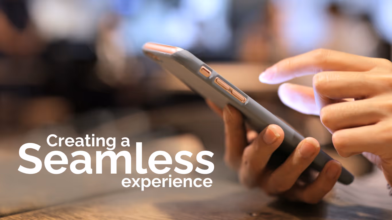
Here’s the deal, over 60% of global web traffic comes from mobile devices. If your website doesn’t deliver a seamless experience on smartphones and tablets, you risk losing valuable traffic, customers, and revenue. But it’s not just about usability, Google now prioritizes mobile-friendly websites in its search rankings. That means your website’s responsiveness can directly impact your visibility online.
Key Reasons to Go Mobile-Friendly:
“A website that doesn’t work on mobile is like a storefront with a locked door, it turns customers away before they even get inside.”
Let’s get real, a non-responsive website can hurt your business in ways you might not even realize. Here are some red flags to watch for:
Not sure where your website stands? Use these free tools to assess your site’s mobile responsiveness:
These tools will give you a solid starting point, but improving your site’s performance requires more than just running a test.
While there are plenty of step-by-step guides and website builders out there, creating a truly mobile-friendly site isn’t always as simple as checking a box. It requires expertise in:
Sure, you can DIY some fixes, but if you want a polished, professional result that boosts your SEO and conversions, it’s worth partnering with experts like us.
Make sure your Mobile-Friendly Website serves visitors on any device:
Let's discuss your projects, your market, and how visual-first design can position you as the premier choice when industry partners refer $2M+ clients your way.
No pressure. Just an honest conversation about what will work best for your business.
Ready to get started? Let's discuss the marketing needs of your business.
+1 (702) 321-0790
A 30 minute Digital Strategy Session is the perfect way to start. No cost. No obligation.
Book with Calendly